Retrospective: Celebrating Shilliam Snakeback's 40 Year Anniversary
Okay, so Shilliam isn't 40 years old, it's still quite a magnificent title, don't you agree? While Shilliam hasn't had much time to shine in the comic recently (which will change very soon, I assure you), he's easily one of the most fun characters I've ever drawn and written.
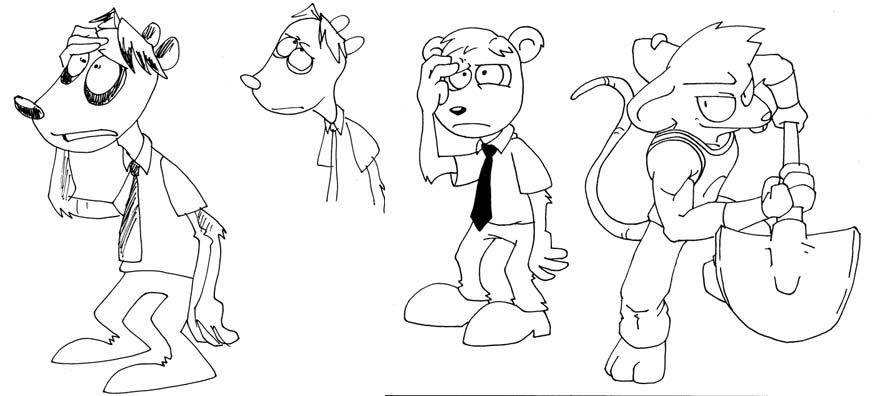
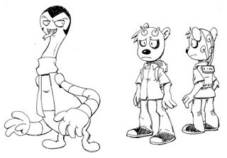
 These three images of Shilliam are some of the earlier images I have. In fact the one on the far left is the initial design of him. Obviously his design contniued to be altered and changed.

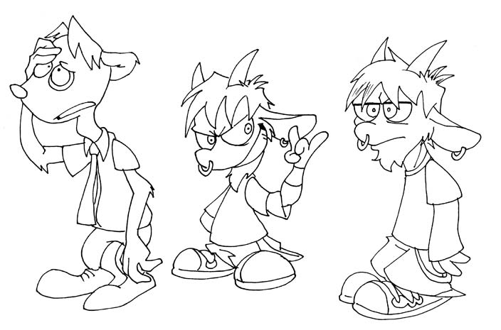
Some more design sketches of Shilliam. His neck got far longer, and his body got wider. You'll also notice his 'Eyes in the Back of My Head' move from the opening of episode 8.
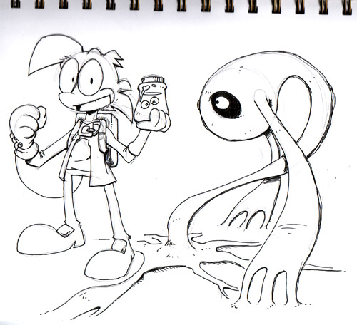
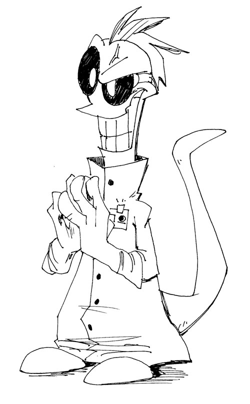
 And here we are, the most recent and final design of Shilliam. He became a lot heavier on the bottom, but his long neck stayed. This sketch shows him in comparison to Terrance, to give you a general idea of his size. Shilliam is huge, and could probably give Cyro a real run for his money.
 These three images of Shilliam are some of the earlier images I have. In fact the one on the far left is the initial design of him. Obviously his design contniued to be altered and changed.
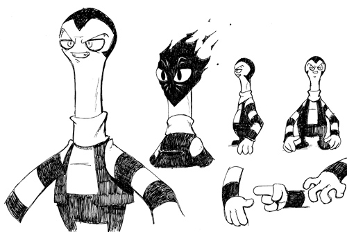
Some more design sketches of Shilliam. His neck got far longer, and his body got wider. You'll also notice his 'Eyes in the Back of My Head' move from the opening of episode 8.
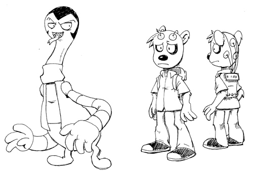 And here we are, the most recent and final design of Shilliam. He became a lot heavier on the bottom, but his long neck stayed. This sketch shows him in comparison to Terrance, to give you a general idea of his size. Shilliam is huge, and could probably give Cyro a real run for his money.
posted by poinko at 3:05 PM
2 comments
![]()
![]()